I noticed some discussion on Noveporte about the positioning of stripes on the edge of a lapel and thought I would give my opinion on the matter here.
Because of the way I was trained, things like this just jump out at me, and strike me as being a bit careless. I understand that to others it may not be important. Notice the stripe line vis-a-vis the edge of the lapel.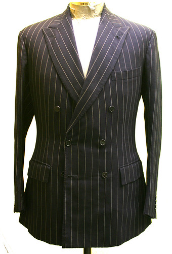
People will point out that the edge of the lapel is not straight, and that DB lapels in particular benefit from a pronounced curve to the edge, and they are correct. The curve is quite noticeable in the photo above. Also very noticeable is the concave curve at the tip of the lapel which I find particularly objectionable. This curve also causes stripes to be cut off toward the top or the bottom of the lapel, another thing which I don't particularly like. You will see the stripes cutting off at the bottom of factory-made garments because it is not practical in an assembly line to do otherwise; sartorial, or bench-made garments, can be done differently.
I was taught that the edge of the facing should be worked up with the iron, stretching and shrinking the facing so that a nice belly can be cut, but that the stripe will still follow the shape. Notice in this photo that there is a pronounced belly (the yardstick is used to show the shape); notice also that the stripe, rather than running parallel to the yardstick (which is straight) follows the curve of the edge of the lapel.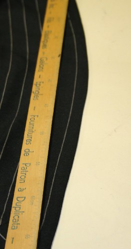
The facing has been worked up so that the line will run straight, parallel, and won't be chopped off by the curved edge of the lapel. The result is that the shape draws much less attention to itself and is more subtle and harmonious. In my eye, anyway. And this is, of course, a matter of personal preference and as such is open to debate.
I much prefer this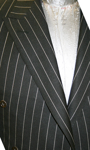
To this

but I have, after all, been brainwashed into thinking that.
Thoughts?
EDIT
there was a question about stripes cutting off. Here is an example of what I mean. You may have never noticed these things before, but once you start looking at them they can drive you a little crazy. Or maybe it's just me. But those sleeves are just dreamy.....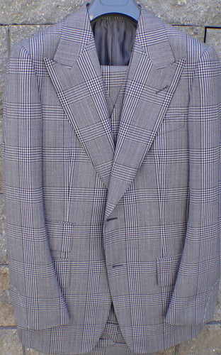
The stripe on the lapel on the right (wearer's left) has been highlighted to show (I hope I'm being more clear now) how the stripe is cut off by the shape of the lapel- the stripe is straight but the lapel is curved so the stripe stops 3/4 of the way down. On the left I have shown how the stripe would run if the facing had been worked up in the manner shown above- the stripe would run parallel to the edge all the way down the lapel despite the curve in its shape.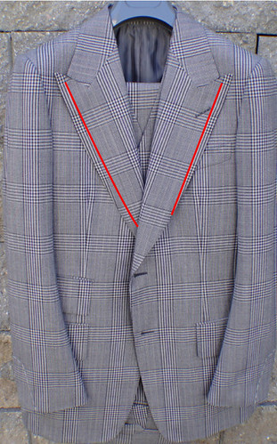
rnssnc is correct- this is a Tom Ford suit. I haven't examined one closely- I had a quick look when they first came out and my first impressions were quite good but I know they have made some changes since so I would rather not comment ( I would very much like to get my hands on one to have a good look but they are rather expensive, even on ebay). Certainly the "hanger appeal" as we call it in the trade is exemplary.


24 comments:
I like the cut of your lapel.
This lapel is sloppy. You can have this shape DB lapel and still have the stripe even with the edge. . No pressing or "cooking" of the cloth is needed. You will have some slight . extra fullness in the inside chest , but just distribute it. THis lapel is not right . I have seen Anderson Shep. do this too.. Not good. F.Shattock..
Well, Frank, that coat is Anderson and Sheppard....
Ha , Hi , Jeffery ,, I spelled my name wrong..
I do not like the way it is done in the A&S jacket at all - it does not look as neat as the other option.
Btw, I cannot see one of the flickr images - could you please check on that?
Thanks, Gentleman's Gazette
Jeffery, I am not even close to being a professional tailor, but to my untrained, amateur eye, that first suit jacket lapel is absolutely awful looking.
Yours is by far better looking. Neater, crisper, cleaner.
Sewsy
Time was taken to match the pocket jets (which is used as a selling point) but the most visual part of a striped / checked jacket was neglected.
I can't think of any arguement in favor of the first lapel. Careless.
Good grief! whatever was the cutter at A&S thinking when he laid out the pattern of this striped coat?
Too much belly on the lapels. And what idiot decided to press the stripes downward at the peaks? It's bizarre.
Suffice to say, Jeffery, you're a far, far better designer and tailor than the hamhanded workers who put this thing together.
JMB
In the first picture, the stripe travels along the entire lapel, so that it bisects the peak of the peaked lapel, so it strikes me as more of a stylistic choice than a mistake.
There seems to be slightly less of a belly on the lapels you prefer.
- M
The version with the worked up facing is beautiful and obviously ideal.
I don't particularly object to the stripe not running parallel to the edge of the lapel, as long as it doesn't run off the edge. But that's my RTW perspective, real tailoring deserves better!
I agree the additional curve near the peak of the lapel should have been eliminated in pinstripe - it makes the stripe look crooked.
I 100% agree. When the pattern isn't harmonious with the design I immediately think cheap and off the rack. It is interesting to see that even on expensive suits this is something that gets overlooked. It appears that the tailor has even allowed the buttonhole to distort the stripe creating the crooked appearance other commentors have mentioned.
Yours is far better. Not brainwashing, just good sense.
Just an additional question on stripes matching on the back of a jacket. Sometimes I have seen stripes perfectly parallel along the central seam of the jacket, sometimes I have seen stripes converging to the seam, sometimes I have seen stripes with a sort of "egg" effect, diverging at the middle of the seam and converging at the top and the bottom of it. I understand this effect is due to the convexity of the back. Which is in your opinion the best solution?
That A&S really is ugly. Proper ugliness.
Wow, that's an incredible difference. It's amazing what you can do with a little steam and an iron. Thanks for the detail of the post!
What a difference. It's unfortunately attention getting in the first jacket.
Luca -- that is an excellent observation. I'd be interested in another blogpost on this topic or other's opinions.
Jeffery could you elaborate on that please:
"You will see the stripes cutting off at the bottom of factory-made garments"
What do you mean by cutting off?
@Anonymous- see photo posted above.
@Luca- you are right- it has everything to do with the shape of the back. You an conceal a little bit of this with some clever ironwork (I posted about an idea Chris Despos gave me last year) but in the case of stooped figures or very prominent blades, you will not be able to avoid some visible "egg" effect. This is one instance in which, IMO, fit takes precedence over the aesthetic appearance of stripes.
J
maybe i'm stupid, but i still dont understand what you mean by cutting off?
that's a tom ford suit you are showing there... what's your view on them? worth its money? have you taken a tom ford suit apart?
thank you thank you, crystal clear now, and i think you are right, it is already starting to drive me crazy.
i am a huge fan of tom ford suits, and i own a few, but none of them are patterned, although the patterned ones (especially check) are the ones that epitomizes the tom ford look.
they used to be all made in italy, now they are made in switzerland (still by zegna), which I have an inkling to feel that to increase margins, shortcuts are taken, expenses are lowered. however, in his latest collection, i believe he's starting to revert back to making them in italy. although this is all a layman's view, where it's made may have nothing to do with quality, but from what i know, all of zegna's top of the range garments are strictly made in italy.
Thank you for that explanation.
The curve in the lapel of the first jacket doesn't cut off any lines however, not? You just mentioned that as a general flaw with factory-made garments, yes?
The lines do not cut off, but they do not follow the edge of the lapel in a perfectly parallel line, which, in my opinion, is the best method.
J
I have never noticed this issue with patterns (admittedly, all my striped jackets are single breasted), but unmatched stripes on pockets annoy me incessantly.
Post a Comment